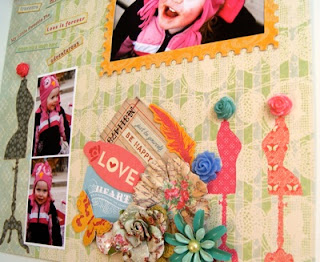
This isn't a post about how you should use what you have in your stash. We all know we should use what is in our stash. This is a trick that while obvious, I often overlook or even fight against. It is using your patterned paper to embellish for you. Sounds simple enough, right?
Papers like Webster's and Prima are perfect examples of papers that have so much embellishment already built in for you. How much you add beyond that is personal aesthetic. I did this layout of that goofy niece of mine and I let the paper be as much of a lead player as a background one.
I wanted to use the dress forms on the Webster's paper, so I added a flower brad to the tops of them. For me, this page is very simple in it's amount of embellishing and it's design. It only took me about an hour to finish this one from conception to display, as opposed to the regular two hours plus it takes me to complete a layout.
Another simple page is this one of two silly shots taken at the Eclipse premiere last year. I wanted quick and kind of campy to match the photo, (or more specifically, the photo of me in what the Hubs call a Katy Perry pose), and this Marah Johnson for Creative Imaginations paper kept calling to me.
This was another one (hour) and done. Nothing too over the top, just a glimpse at that few moments in time. I used my cutting blade to cut out some of the red drips from the top and slid the polka dot paper and the photos underneath.
Pretty underwhelming when you think about it, but I find many times that I pull out a piece of patterned paper and I struggle with how I would be able to work photos into the existing print without losing any of the main parts of the pattern. For examples that utilize the papers, as well as feature fantastic embellishing for true works of art, check out either Webster's Pages or Prima. The members of their design teams are crazy talented.


That cluster in the lower corner on the first lo is just great. I like how you put brads on the dress forms, too. But my fav part of that lo is the smile on that adorable kid!
ReplyDeleteOk, how did you do the drips on the second lo? That is wonderful and the lace trim...Wow!
Girl, you are so talented! Love both of these!
ReplyDeleteYes! How very true. Too much extra stuff can take away from the pretty paper and pictures.
ReplyDeleteThese layouts are great, love the campy Twilight one, and your Katy Perry pose! lol
Courtney
The drips are what I'm trying to figure out too! I very much like them. :) And brads on the tops of the dress forms.....great idea! And that metal looking flower....is that a piece of granny type jewelry? You must 'splain yo'self! :)
ReplyDeleteI love the little cluster of lovelies at the bottom of the first layout. You always cluster things so nicely. When I do it it is like my scrap drawer barfed on my page.
ReplyDeleteThe twilight one is very twilight. I just got a new set of Edward Cullen brushes for photoshop yesterday. *hearts*
Great layouts, Lora! Webster's always seems to speak for itself, doesn't it? Love the lace trim on your 2nd one!
ReplyDelete